We’ve been using MindManager to create weekly and monthly reports (status update and accomplishments maps), which we find to be a better format than PPP and Excel dashboards. The Excel Range function that we recently discovered is extremely helpful. It allows us to display selected data from a parent spreadsheet residing in SharePoint on the map by creating a dynamic display. This eliminates duplicate data entry – once a parent spreadsheet is updated, data in the spreadsheet within the map is updated automatically and there is no need to update data in the map manually. This saves us a lot of time and helps in prevening errors that come from double entry. We’ve been very excited about this function.
There was a problem though – a person who doesn’t have access to a parent spreadsheet will not be able to see data on the map. I called MindJet CS and was delighted to find out that you can actually break a link to a parent spreadsheet, which in turn will convert the datasheet on the map to a static form. It is very easy – just right click on an Excel icon shown on a map’s spreadsheet and select Disconnect from Microsoft Excel. Problem solved! 😎
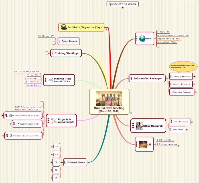
I’d like to highlight Safique Hazarika’s comment from the April 4th‘s post as it describes quite tangible benefits of switching to the mapping method (i.e. saving up to 20 minutes during each meeting).Following Safique’s feedback below, I’ve included a map from the most recent Mumbai team’s planning meeting. I am proud of the team’s creativity and commitment to innovation!
Written by Safique:
“This is creative and interactive. I want to convey the result and confirm how effectively this tool is working for the Mumbai Global Research Library team. I must agree with Larisa that being a global virtual team the challenges of collaboration/networking/idea sharing/tracking are enormous, and I guess this is true for all other virtual teams as well. But this alternative is undoubtedly a ray of hope.
Immediately after transitioning our weekly global meeting through MindJet workspace with the agenda map template mentioned by Larisa, we in Mumbai adopted the same approach for our local Monday weekly planning meeting. Unlike earlier, using white board to write agenda/task for the week and one person taking minutes meeting and later drafting notes, this time we used the projector and run this agenda map. Map template was already filled by respective team members with their task/comments in respective fields before coming to meeting – hence no more white board and no more meeting minutes. Agendas, tasks, comments in the Map are more clear, with pictures and mapped to its objective and expected desired results with deadline & follow up. Though we yet to evaluate the complete benefit and pros & cons of this application but I must say the result is impressive so far and also saves 15-20 minutes each meeting.
Apart from meetings, the most potential and promising is the use of idea maps in new projects, from the idea generating stage to the post-project evaluating phase. Team members have embraced this process quite generously, as it is getting interesting, and most importantly, this process tickles the creative minds and evoke thoughts to bring better results”.
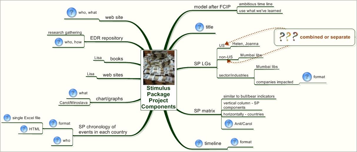
We are currently working on an information guide to global stimulus packages and government bailouts around the world. The goal is to provide our clients with high quality information and resources to help them learn and understand the complex topic that keeps changing. Although we’ve done big research projects in the past (i.e. Financial Crisis in Perspective), this project presents special challenges.
The topic is a “moving target” and new information becomes available every day.
The volume of information is enormous. The topic is covered profusely by media, press and experts. We need to distill it to a manageable amount by analyzing and selecting the best pieces only.
We want to create a multi-type guide that will include literature (research, news, opinions, and books), charts, graphs, metrics, web sites, etc.The challenge is that we are still developing a new methodology for this multi-sensory approach to information delivery and don’t have a clear road map for implementation.
It is a huge project with all 15 team members and 4 library locations involved in different aspects. Bridging communication and collaboration gaps is crucial to success of the project and how quickly we can deliver it to our clients.
Because the topic is in high demand, we must move fast and complete the project in 4 – 6 weeks.
After multiple preliminary discussions between different team members, we finalized our thoughts and ideas at the team meeting with the help of an idea map (see below). We’ve been using maps routinely in our work since January, and this time around – without a doubt – visualizing what we wanted to do enabled us to clearly see a big picture and at the same time determine smaller components.Through a 30-minute brainstorming session, we quickly realized the areas where we were unclear (branches with question marks) and gained needed clarity to move ahead.Without mapping, I believe we’d spend at least one more week in planning.
We are a global team.For years, we’ve depended on MeetingPlace or NetMeeting as standard communication tools enabling us to connect and work together in a virtual space during our weekly team meetings.In the past few weeks, we are taking our meetings to the next level with the help of the idea mapping method and MindJet.
As a collaboration tool, remote meetings have many disadvantages.The risk of misunderstanding increases when you have more than a dozen of people from different countries attending a call. You cannot see your colleagues (you can, of course, with video conferencing technology, but we are not there yet).Right there, you can miss a lot in terms of subtle communication including body language, facial expression, mood, worries, etc.Even with well established and time-proven rules of meeting engagement that we’ve developed and implemented over the last 4 years, team collaboration and engagement during a traditional teleconference suffers the limitations that come with that medium.Add to that the routine nature of the meetings and we can understand why some meetings are less than energizing and simply boring.These are a few reasons why we’ve decided to enhance our meetings by using real time collaborative mapping as an alternative to net meetings.
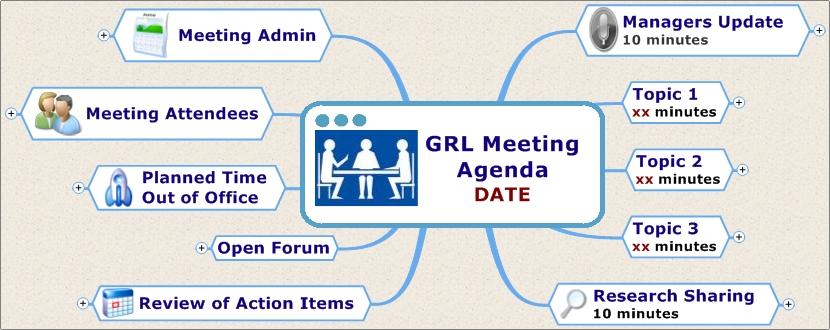
We had a lot of fun creating a meeting agenda map template (scroll down to the March 7 post for details).The map contest winner was Safique Hazarika, our Mumbai manager.His map (see below) is now being officially used for our weekly staff meetings. We all were very excited during the first map meeting and everybody was engaged in contributing comments, adding notes and – to my surprise – decisively rearranging branches and taking ownership of the map. It was fun to see small icons of people with corresponding names moving around the map IN REAL TIME.Even if you cannot see faces, there is an increased perception of personal presence that you get using this tool.There is also a sense of stronger connection between team members. In the following weeks, we’ve taken a few steps to make our map meetings more efficient (we all enjoyed that creative chaos of the first meetings but there is work to be done!).Each week’s agenda items are added to that week’s map by team members prior to a meeting, with as many details as needed, including document attachments. This material can be reviewed in advance of the meeting. To avoid multiplication of notes taking during a meeting, we’ve decided to designate a single person to add notes to the map as discussions take place. Each person can add his or her notes if he or she feels that not all important points were captured by a designated notes taker.We want the process to be flexible but not too distractive. We keep meeting maps in the MindJet Connect folder that everyone can access at any time.It is hard to say at this early stage whether or not real time map meetings will be a much better alternative to traditional net meetings in terms of increased effectiveness and better results, but we’ve already seen a few benefits including:
increased team members’ engagement
heightened sense of connection with colleagues
breaking routine – we feel energized and have fun
These are intangibles that are hard, if not impossible, to measure. But we all know how important they are for building stronger teams.
As a global team, most of our collaboration happens remotely.Over the years, we’ve implemented good communication practices, enhanced business processes and strengthened culture of collaboration.All of this, we’ve realized in the last few months, hasn’t been enough for achieving desired results in a timely fashion. Maturing as a team, we’ve come to conclusion that one of the big issues for us is communication quality, primarily the goal of achieving understanding and preventing misunderstanding.
Physical act and volume of communication don’t automatically mean true understanding.And identifying hidden spots of misunderstanding among team members is not easy but critical to the team’s success.Team members confirming that they understood concepts, tasks or assignments may genuinely believe that they are on the same page with others.Later, the final results, being less than expected, make everybody wonder how things could go off the desired track, in spite of the best communication practices used in the process.If you work on a virtual and multi-cultural team, this scenario happens quite often and can lead to loss of productivity, diminishing trust between team members and drop in service quality.
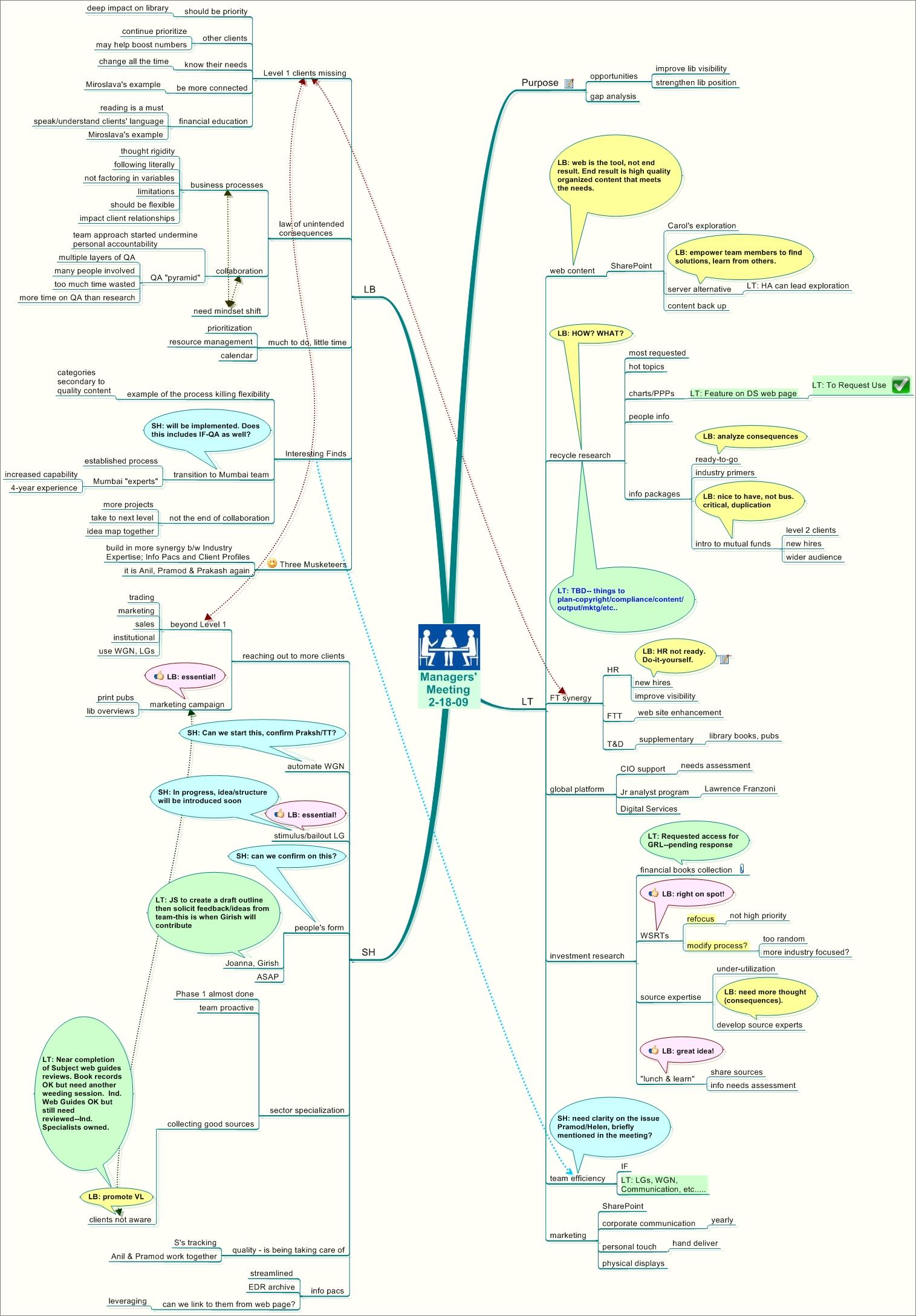
To identify and, ultimately prevent, misunderstanding, we started to use maps. For example, at the recent managers’ meeting, we shared ideas about emerging opportunities for the library during this worst recession in history.The one-and-a-half hour meeting was set up as a teleconference, with one manager calling from Mumbai, India. After the meeting, using MindManager, I created a map summarizing key concepts of our discussion, provided additional comments that I hadn’t had time to offer during the meeting, and invited meeting participants to insert comments or questions within the map.The managers reviewed the map and added a few callouts with questions and comments (see the attached map).There were about half-a-dozen questions in the map that were not asked during the meeting (either because of time constraints or other reasons) – showing to me that those areas needed further clarification.It is possible that if I hadn’t sent the post-meeting map, those questions might have never been asked, leading to misunderstanding and all unpleasant consequences that misunderstanding entails.
For many years, we’ve measured the impact of the professional library and information services on investment research and portfolio groups in our organization through the library usage statistics.Every quarter and at the end of each fiscal year, using the database that captures library usage data, we produce a management report for each client group that shows how the members of each group used the library.Among the main elements of a standardized one-page management report are requests volume, types of requests, number of documents researched and filtered by librarians, time saved by the library and a dollar value of saved time. In addition to charts and graphs, we also include brief descriptions of most important initiatives/projects that directly benefited our clients, and a list of team members who used the library and how often.The report helps us to quantify the library work and show through the use of numbers the growing demand for library services worldwide.
In October 2008, after a series of cost cutting measures we went through the first round of downsizing.Threats of economic and financial crisis suddenly became very real.Concerned about the library, we needed to find a more effective marketing approach than just usage statistics to convey the message of value that the library brings to the investment process.We had to somehow interpret and give a meaning to the year-end data/accomplishments in a way that would leave no doubts that the library is an important resource that contributes to the organization’s bottom line.In other words, in this – as in any – crisis, good information is more important than ever, and that makes the library even more indispensable.
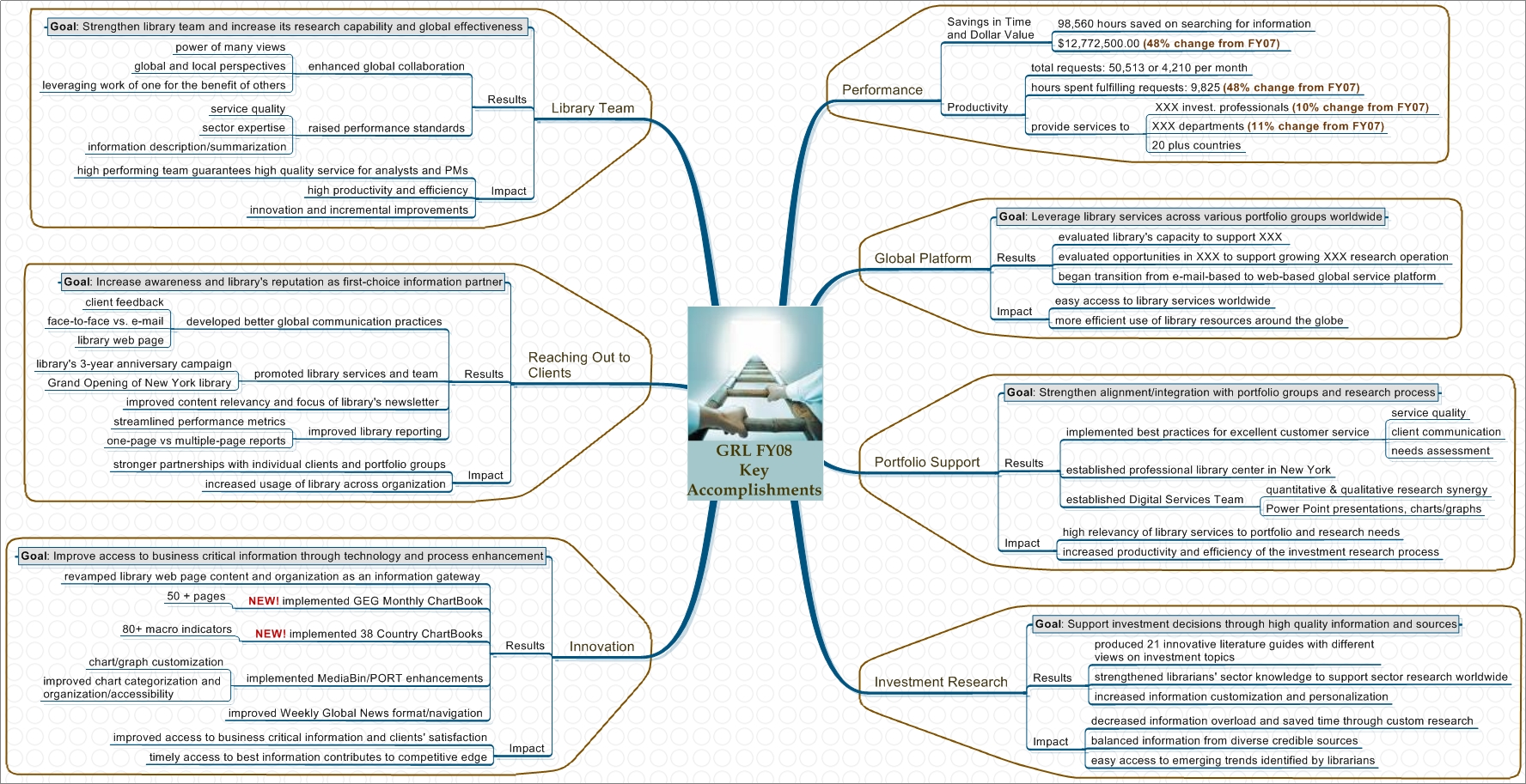
Below are the two idea maps that I created (using MindManager) to conceptualize in a simple visual way the key strategic areas where the library has an impact.These maps compliment the statistical report which by its nature cannot clearly explain the library’s contribution to the company’s strategic goals and objectives.The At-A-Glance map highlights our accomplishments in the context of what is highly relevant to all senior executives: cost control, improving productivity, risk management and competitive edge.Because a lot of what we do is innovative, I am showing innovation as a foundation of all our initiatives.The second map takes pretty much the same information but presents it in the context of the organization’s very specific strategic priorities.We packaged the reports and maps together and put them on the library’s web page as a FY08 year-end review.
Has our new marketing approach worked? Were we able to send a strong value message across to those who make budget decisions? I don’t know for sure. Unfortunately, we lost a dear friend and colleague to the second round of downsizing in January. Could we have lost more people had we not tried to strengthen our marketing message using conceptualization and visualization techniques? Possible, but it is hard to know.What we know, however, is that seeing the emerging risk we tried a new approach and did the best we could to manage it.
Marketing is a combination of art and science. Or shall I say ‘right brain and left brain’?2008 was marked by deep economic downturn, recession, fear and financial losses.In the environment of cost cutting and downsizing, marketing becomes a powerful tool many managers use to communicate value their departments bring to organizations.A corporate library is a service business.Like in any service business, quantifying its impact is a difficult task.How do you, for instance, put a price tag on information that leads to a profitable investment decision or saves from bad investment choices?In this series, I’ll share some marketing ideas and best practices implemented in my library.
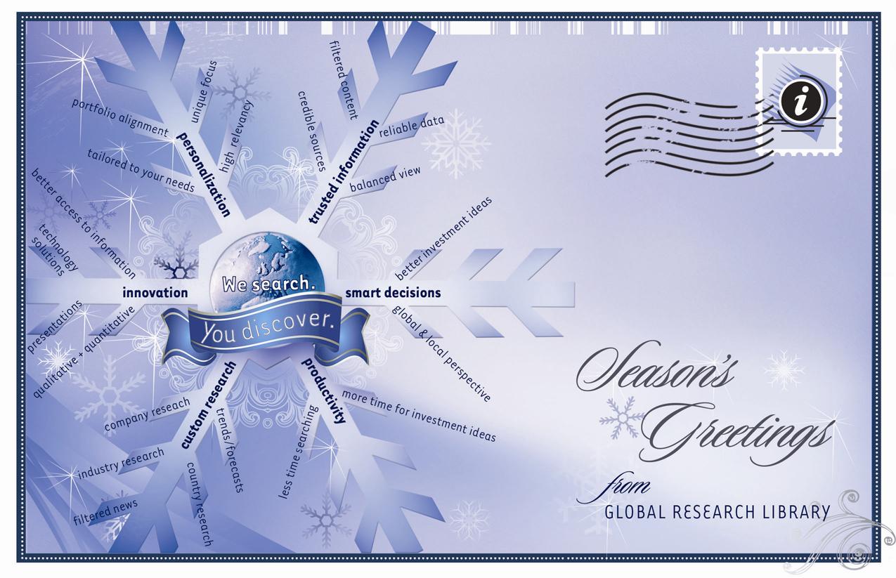
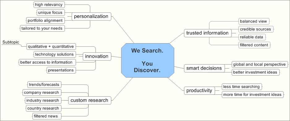
Season’s Greetings Post Card
We have a client-focused culture, putting our clients first. In fact, if you ask librarians, many will tell you that they enjoy working with their clients and go extra mile to satisfy and exceed their expectation.To wish our clients a happy holiday season, we’ve created an electronic post card (for quick and easy delivery around the globe) with a giant snowflake and a look and feel of a traditional winter holidays card.Except, we used the snowflake to convey key concepts and ideas that represent library services and values.We wanted to highlight areas where we make impact in our clients’ lives, but do it indirectly, in a subtle way.The card turned out to be a hit.
It is worth mentioning, that I used MindManager to conceptualize the snowflake’s branches and key word/key phrases.I was working remotely and couldn’t talk face-to-face with Miroslava Litwak, who created a graphic design and did a great job turning the concept into a product.Sending Miroslava a map (see below) reduced the need for multiple phone discussions and saved us a lot of production time.
![[blinklist]](http://powermapping.ideamappingsuccess.com/IdeaMappingBlogs/wp-content/plugins/bookmarkify/blinklist.png)
![[BlogMarks]](http://powermapping.ideamappingsuccess.com/IdeaMappingBlogs/wp-content/plugins/bookmarkify/blogmarks.png)
![[Blogsvine]](http://powermapping.ideamappingsuccess.com/IdeaMappingBlogs/wp-content/plugins/bookmarkify/blogsvine.png)
![[del.icio.us]](http://powermapping.ideamappingsuccess.com/IdeaMappingBlogs/wp-content/plugins/bookmarkify/delicious.png)
![[Digg]](http://powermapping.ideamappingsuccess.com/IdeaMappingBlogs/wp-content/plugins/bookmarkify/digg.png)
![[diigo]](http://powermapping.ideamappingsuccess.com/IdeaMappingBlogs/wp-content/plugins/bookmarkify/diigo.png)
![[Facebook]](http://powermapping.ideamappingsuccess.com/IdeaMappingBlogs/wp-content/plugins/bookmarkify/facebook.png)
![[Jeqq]](http://powermapping.ideamappingsuccess.com/IdeaMappingBlogs/wp-content/plugins/bookmarkify/jeqq.png)
![[Ma.gnolia]](http://powermapping.ideamappingsuccess.com/IdeaMappingBlogs/wp-content/plugins/bookmarkify/magnolia.png)
![[Mister Wong]](http://powermapping.ideamappingsuccess.com/IdeaMappingBlogs/wp-content/plugins/bookmarkify/misterwong.png)
![[Netvouz]](http://powermapping.ideamappingsuccess.com/IdeaMappingBlogs/wp-content/plugins/bookmarkify/netvouz.png)
![[Newsvine]](http://powermapping.ideamappingsuccess.com/IdeaMappingBlogs/wp-content/plugins/bookmarkify/newsvine.png)
![[Propeller]](http://powermapping.ideamappingsuccess.com/IdeaMappingBlogs/wp-content/plugins/bookmarkify/propeller.png)
![[Reddit]](http://powermapping.ideamappingsuccess.com/IdeaMappingBlogs/wp-content/plugins/bookmarkify/reddit.png)
![[Slashdot]](http://powermapping.ideamappingsuccess.com/IdeaMappingBlogs/wp-content/plugins/bookmarkify/slashdot.png)
![[Sphinn]](http://powermapping.ideamappingsuccess.com/IdeaMappingBlogs/wp-content/plugins/bookmarkify/sphinn.png)
![[StumbleUpon]](http://powermapping.ideamappingsuccess.com/IdeaMappingBlogs/wp-content/plugins/bookmarkify/stumbleupon.png)
![[Technorati]](http://powermapping.ideamappingsuccess.com/IdeaMappingBlogs/wp-content/plugins/bookmarkify/technorati.png)
![[Twitter]](http://powermapping.ideamappingsuccess.com/IdeaMappingBlogs/wp-content/plugins/bookmarkify/twitter.png)
![[Email]](http://powermapping.ideamappingsuccess.com/IdeaMappingBlogs/wp-content/plugins/bookmarkify/email.png)

